Plausible's public dashboard shows why to split app traffic
Plausible publishes its live stats for anyone to read. One number in them explains why most SaaS teams report a conversion rate that isn't real.

Plausible publishes its own live traffic at plausible.io/plausible.io, so anyone can read the numbers its team reads. On 18 July 2026 the top row said 286k unique visitors over 28 days. The homepage got 41.4k of them. The rest were customers opening their own stats, which means the headline number mostly measures the product, and every rate you divide by it comes out too small. Split app traffic from marketing traffic and the same dashboard tells a different story.
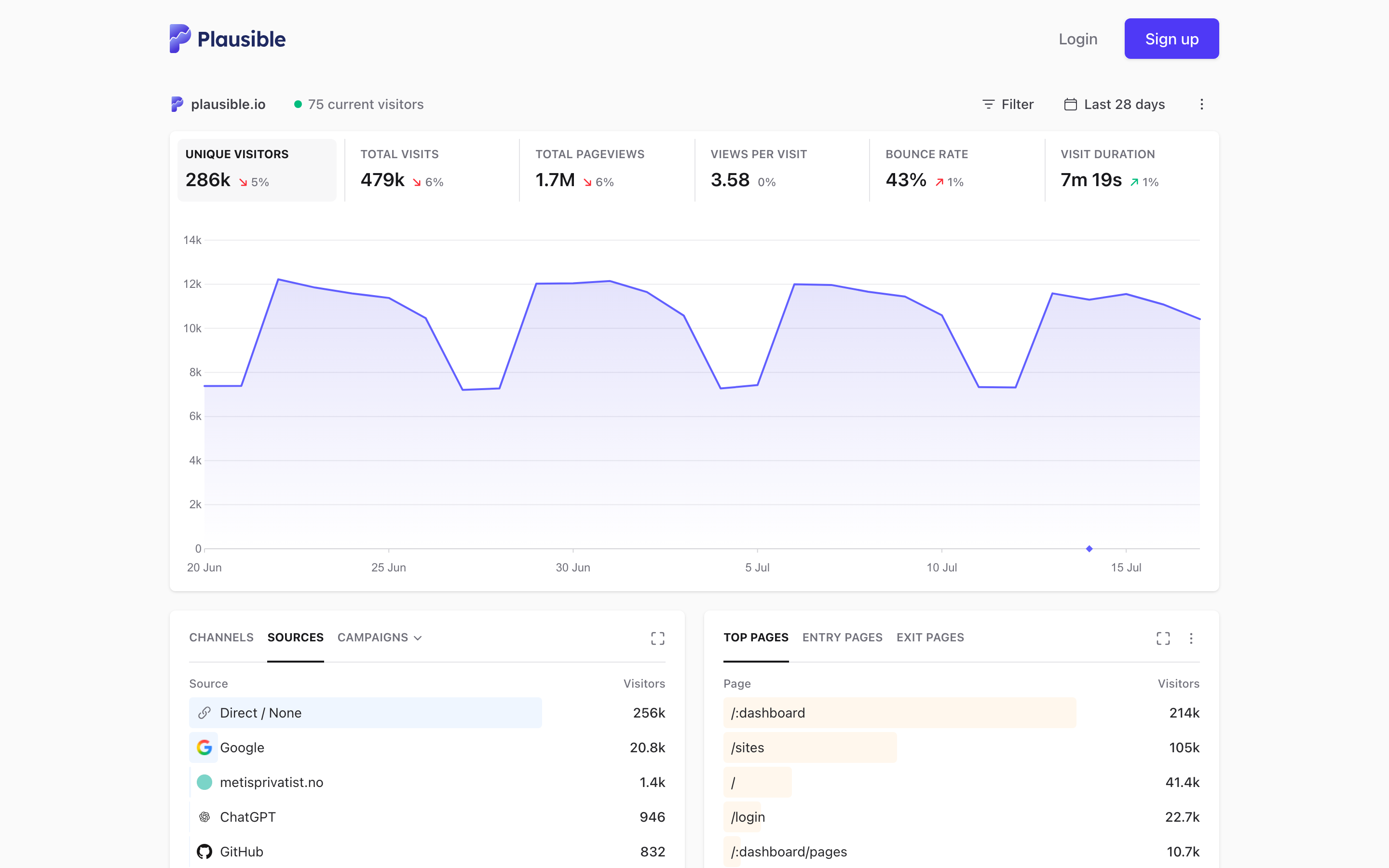
The top pages panel does the splitting for you
Read the right-hand column: /:dashboard 214k visitors, /sites 105k, / 41.4k, /login 22.7k. The main app screen pulled five times the homepage on its own. Two app paths and the login page account for most of what the top row counts.
That shape arrives at every SaaS site once the product has customers. The marketing site keeps growing at its own pace while returning users hammer three URLs every working day, and the blended total drifts away from anything you can act on. A visitor count that goes up because retention improved tells you nothing about whether last month's content landed.
The fix takes ten minutes in any tool. Define one segment for the pages a stranger can reach and one for the paths behind login, then report them apart. In Plausible that's a page filter or a saved segment. In GA4 it's an explore filtered on page path. What you want on the weekly view is the marketing number, with the app number sitting next to it as a separate line.
Direct traffic here is customers, not brand demand
Sources tell the same story. Direct sits at 256k of the 286k. Google brings 20.8k. Then a long tail: metisprivatist.no at 1.4k, ChatGPT at 946, GitHub at 832.
Nine in ten visitors arriving direct would be an extraordinary brand signal on a marketing site. Here it's people typing plausible.io or hitting a bookmark to check yesterday's numbers. Measured against everything, Google looks like 7% of the business and search looks optional. Measured against the 41.4k who land on marketing pages, Google is one of the biggest doors into the company. Same table, opposite call on whether SEO is worth funding.
The tail is worth a second look too. ChatGPT shows up as a named referrer ahead of GitHub, which matches what we saw when AI referral traffic consolidated into one channel. Small now, named and countable, and easy to baseline while it's still small.
The goals table is where a bad denominator costs money
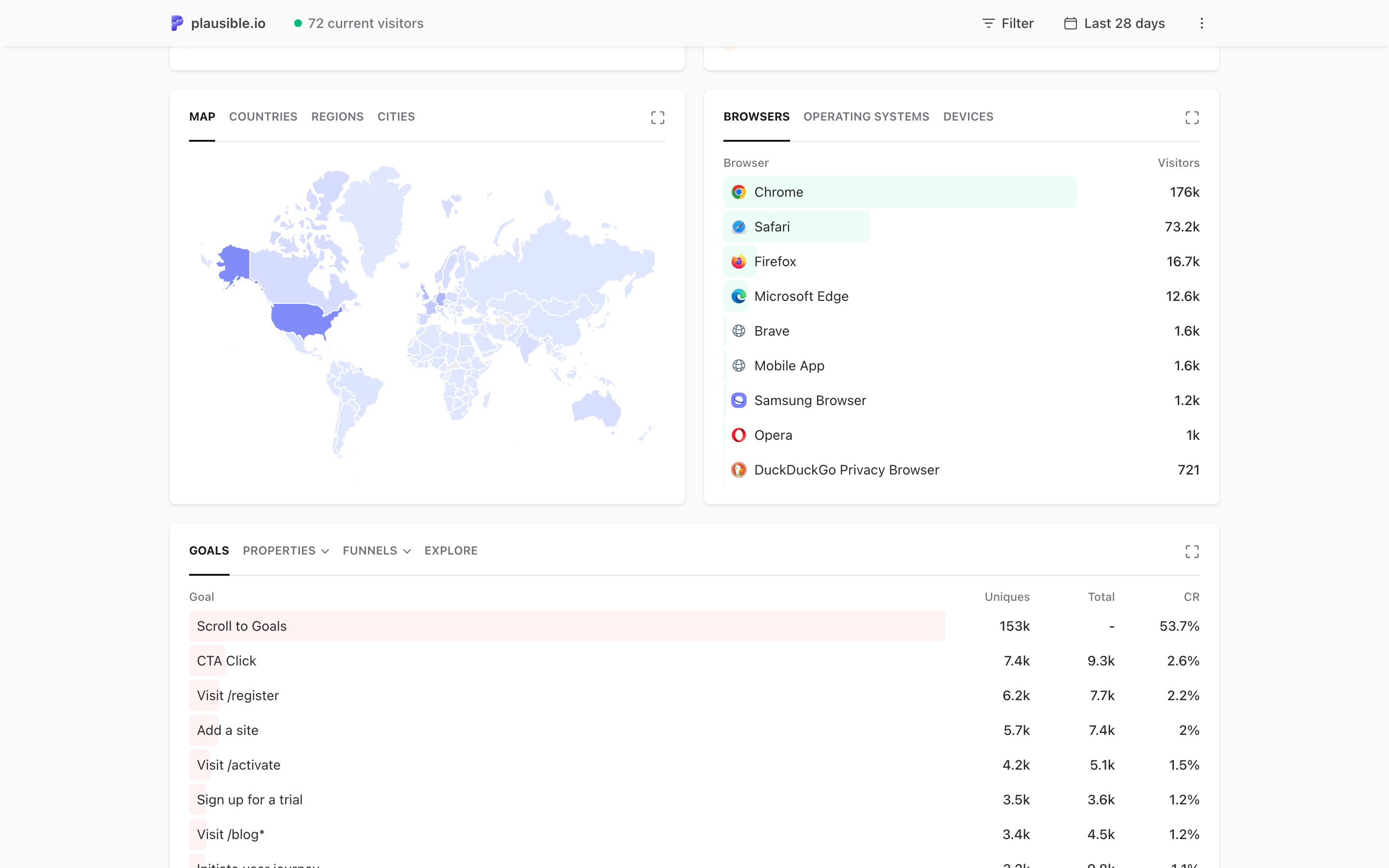
Scroll down and the goals are public as well. Scroll to Goals: 153k uniques, 53.7%. CTA Click: 7.4k, 2.6%. Visit /register: 6.2k, 2.2%. Add a site: 5.7k, 2%. Visit /activate: 4.2k, 1.5%. Sign up for a trial: 3.5k, 1.2%.
A 1.2% trial rate would read as a weak funnel if you took it at face value. It's 3,500 trials divided by 286k visitors, and 245k of those visitors already pay for the product. Against the people who actually saw a marketing page, the same 3,500 trials sit in a completely different band. Neither figure is the whole truth. The rule underneath is the one that matters: the denominator has to be the audience you were trying to move.
There's a second trap in the same table. Add a site fires 5.7k times against 3.5k trial signups, because existing customers add sites constantly. Any goal both audiences can trigger will drift, and it will drift most in the months when retention is going well. Keep one set of goals for acquisition and one for product usage, and never average them into a single funnel.
What to copy this week
Three moves, in order. First, list your top ten pages and mark each one as marketing or app, which takes about five minutes and usually surprises somebody. Second, build the marketing-only segment and rebuild your reported conversion rate on it, then tell the team the number changed and why. Third, audit each goal for who can fire it, and move the mixed ones out of the acquisition funnel.
Do that and the weekly report starts answering a question the team can act on: did the work we shipped bring new people, and did those people start.
Publishing the dashboard is itself a marketing decision
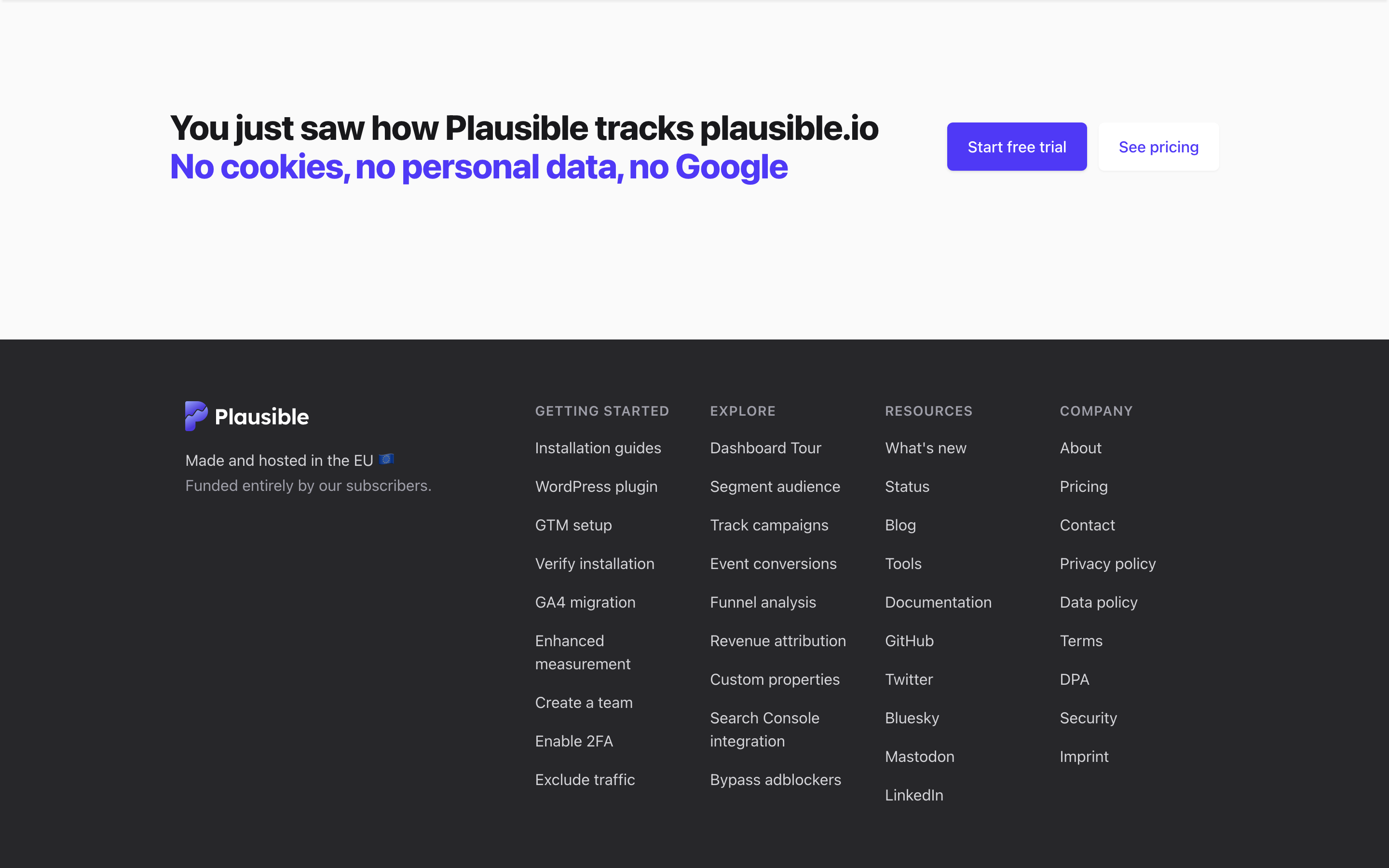
Under the stats sits one line and two buttons: You just saw how Plausible tracks plausible.io. The demo and the proof are the same page. A buyer evaluating an analytics tool gets to poke at real numbers on a real site before signing up, and the company gets a page that ranks, converts, and needs no maintenance.
Most teams can't publish their traffic, and there's no need to. The copyable part is showing the working artefact instead of describing it. If your product produces a dashboard, a report, or an output a prospect would recognise, put a real one on a public URL. It beats a screenshot in a feature grid, and it holds up better than any adjective you could write next to it. That's the same discipline behind an analytics setup you'll actually use: fewer numbers, honestly scoped, in front of the people who decide.
If you want help getting your reporting down to the handful of numbers that drive decisions, that's the kind of work we do.


